Printing
guide
Risograph printing is a spot colour print method based on layers. The ink is pushed through a stencil(1), a master perforated with tiny halftone dots(2), that is wrapped around a spining drum(3) printing at high speed onto the paper that is fed flat through the printer(4).

The machine is called a ‘duplicator’ produced by the Japanese brand Riso Kagaku becomes eponymous and ends up being called ‘Riso Machine’ and its use ‘Risography’.
There is an atlas listing and following the evolution of the practicing riso printers, along with a lot of useful information and technical tips on the stencil.wiki website.

Our main goal (and yours!) is in getting files that have been set up correctly in order to avoid loosing time helping each customer create its layers.
The method is simple, and comes down to a few points we will detail below.
The six points rule:
- GREYSCALE: No RVB, no CMJN, no MULTILAYER (à vérifier). The source images must contain only gresycale informations that will then be transformed into halftones automatically by the Riso. It is therefore not necessary to apply a halftone yourself like you would do when screen printing. Each file can contain different gray values, ranging from lines at 100%, to gradients and elements set at different opacities.
- TIFF (compression LZW), PDF (no compression), JPEG (high quality ) or PSD.
- Flattened: The files mustn’t include effects or multiple layers.
- 300 DPI (It is possible to go up to 600 DPI thanks to our Postscript reader, if you want a very fine result).
- At the actual size, with crop marks and bleed when necessary.
- Ideally, a colour mockup is always preferable. Without it we won’t be able to garantee the files sent to print are correct, and we will have to charge the customer if s/he is not satisfied.

For a book:
A ZIP file sent via Wetransfer comprised of a PDF for each colour used.
Example:
Catalogue_Red.pdf / Catalogue_Green.pdf + a colour mockup PDF of the book.

The type must be set on InDesign or Illustrator (vector) and not on Photoshop (raster/pixel). This will prevent your text from looking pixelated and you will get nice & crisp lines instead, even at 5pt.

Two Colors Separation
Four Color Separations


Crop Marks & Printable Area
We print exclusively onto A3 paper, however there is a non-printable margin of 5mm within the A3 format.

For the standard sizes, you need to consider the whole, including the crop marks and the bleed.
If they are not necessary, for example for an A5 image with a white margins, the crop marks are not needed and you can leave the image full size.
For an A5 full bleed image there are the following options:

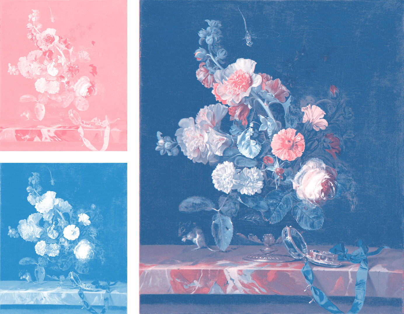
There are many ways of preparing the colour layers starting from an existing image.
The most simple of them consists in getting the channels in the CHANNELS section in Photoshop.
You can then modify your layers according to your taste and the riso constraints explained in the following pages.
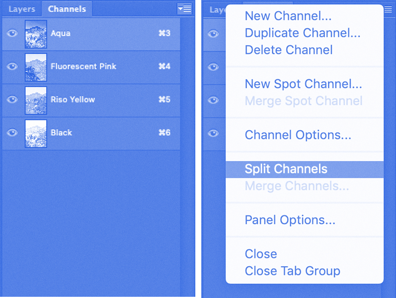
In order to separate them from one another, you simply unfold the drop down menu at the top right corner and select ‘split channels’.
Each channel will then open in a separate Photoshop file that you can save, and rename correctly as indicated earlier.
Superimposing
Superimposing two different layers/colours creates a third one. Here you obtain purple by layering blue and pink.
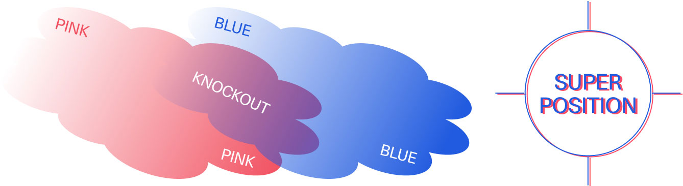
As you can see, superimposing line of small text is not recommended. Same goes for knockout text on two superimposed different layers.
Ink coverage
In riso we use oil based ink on uncoated paper.
Flat colours are never perfectly homogenous if the inked area is too large. Similarily, flat colour areas placed on the side of the print will tend to overink if the area is too large and its opacity was set too high.
Please make sure you set large flat colour areas between 80% and 90% opacity and never at 100%.

There are different types of shift, that can potentially add up to each other, the most common ones being top/bottom or right/left. But the masters can wrapped around the drum at a very minute angle that varies from a drum to another.
The angle needs to be taken into account with double sided prints, mostly for books.


Lines & Outlines
For images using an outline, it is preferable to ‘fill’ the background colors like in this example:


More examples with trapping:

Folding & Other Services


Some things to consider when asking for a quote to print your project with us:


Some things to consider when asking for a quote to print your project with us:
Standard Option
The prices are determined based on four elements. The size, the amount of layers, the amount of prints and the type of paper. We can guide you through your choices according to your finances if you have a specific budget.
BAT
Checking through pictures before printing.
Super Safe Option
We take care of everything!
Just give us your colour files, we will work it from there and adapt them to Riso printing. This option usually costs an extra 30% than the standard order.
Test Print
You can send us a test print so you can rework the files based on the test.
1 / 2 colours: 30 €
3 / 4 colours: 40 €
(We will be using the paper we have in stock in the studio)
Small Press Discount
We offer a 10% discount for small presses.

Deadlines
The production time will depend on our calendar, the standing orders, but mostly on your file preparation and the back and forth updates before we can send the images to print! The more your files are ready to go, the quicker you will get your prints 🙂

Shipping
You can come collect your prints at our studio, otherwise we can also ship them via Colissimo and add it to your bill.
